


One Template, Limitless Styles
Suspendisse mauris. Fusce accumsan mollis eros. Pellentesque a diam sit amet mi ullamcorper vehicula. Integer adipiscing risus a sem. Nullam quis massa sit amet nibh viverra malesuada. Nunc sem lacus, accumsan quis, faucibus non, congue vel, arcu. Ut scelerisque hendrerit tellus.
Lorem ipsum dolor sit amet, consectetuer adipiscing elit. Phasellus hendrerit. Pellentesque aliquet nibh nec urna. In nisi neque, aliquet vel, dapibus id, mattis vel, nisi. Sed pretium, ligula sollicitudin laoreet viverra, tortor libero sodales leo, eget blandit nunc tortor eu nibh. Nullam mollis. Ut justo. Suspendisse potenti.
Morbi interdum mollis sapien. Sed ac risus. Phasellus lacinia, magna a ullamcorper laoreet, lectus arcu pulvinar risus, vitae facilisis libero dolor a purus. Sed vel lacus. Mauris nibh felis, adipiscing varius, adipiscing in, lacinia vel, tellus. Suspendisse ac urna. Etiam pellentesque mauris ut lectus. Nunc tellus ante, mattis eget, gravida vitae, ultricies ac, leo. Integer leo pede, ornare a, lacinia eu, vulputate vel, nisl.
Responsive Design
It has become common knowledge that every day the number of mobile devices used to view your site grows. Responsive design gives your site the power to provide an optimal viewing experience across a wide range of devices from a mobile phone to a desktop computer monitor.
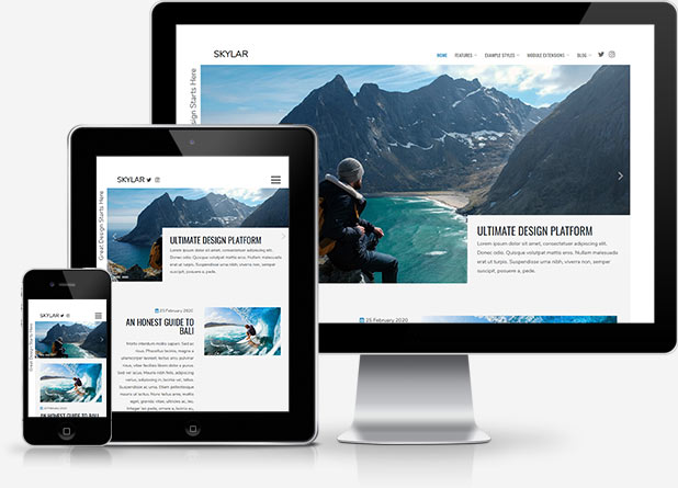 So how does it work? With the use of media queries different CSS style rules are loaded depending on characteristics of the device your site is been viewed with, most commonly the width of your browser. With each set of rules your site will be styled to best display on the matching device.
At Joomla51 we have embraced this new trend in website design and implemented responsive design to all our new releases, resolving any problems assoiciated with how your site will display on smaller resolution screens. To view how your template will respond to each screen resolution simply resize your browser window, as you reduce the width of your browser the template will react accordingly, altering its layout and style to best accomodate the site content within the available viewing area.
Alongside its responsive design, the template features a number of options within its parameters allowing you control over what content is displayed on smaller mobile devices. From your Joomla administration navigate to Extensions -> Template Manager -> J51_[YourTemplate] -> Responsive Options, here you will find a number of toggle switches to turn on/off each set of modules. If there is a situation where you would sooner your site to display the same on all devices then not to worry as we have added an option here to do that to (“,).
Module Variations
This template comes with different module styles and icons. For each module you can pick a style and combine it with an icon creating your own unique look.
You can set your module style via the Module Class Suffix field within your modules parameters. Navigate to Extensions -> Module Manager -> [YourModule] -> Advanced Options -> Module Class Suffix.
Element Styles
Your template comes with a host of Color Choosers and background image options allowing you total control of the look and feel of your site. Simply navigate to Extensions -> Template Manager -> [YourTemplate] to access the full range of easy to use styling options to give your template your very own look to suit your website.